Print Status
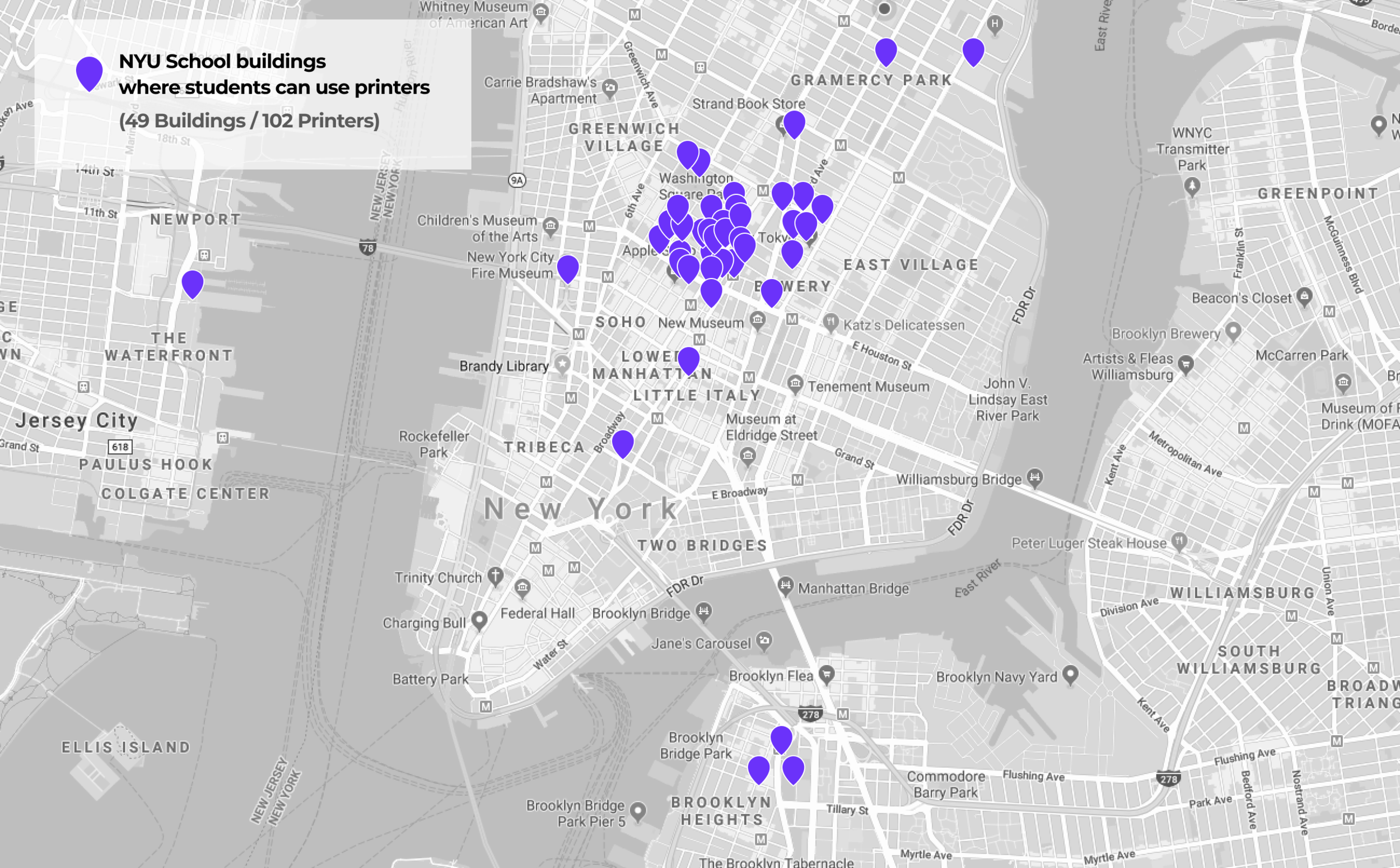
NYU’s global printer map which allows students to print from any printer in NYU’s network around the world
My Role
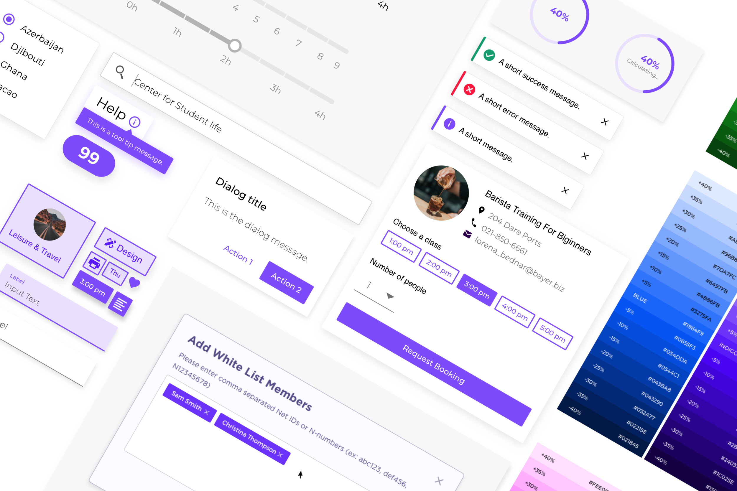
Throughout this project, I contributed to user testing, UI design iteration, and prototyping. Moreover, I worked as a design supervisor to maintain visual consistency by integrating the Torch design system for NYU IT’s branding.
Team
Sarth Desai (Product owner)
Yurou Zhang (Product designer)
Abhliash Kulkarni (Front-end developer)
Hitesh Paul (Back-end developer)
Accessibility team
PRODUCT OVERVIEW
Check all the printers’ location of NYU campus across the world
Find the available printers at any school buildings, and print documents with your mobile phone
Check the nearest printers from your location wherever you are
PRODUCT BACKGROUND
“Where is the closest building that I can print my homework?”
As part of the NYU community, the students, faculty, and staff can use printers that are in NYU buildings. However, previously NYU did not have an integrated platform to track where the printers were. It was a problem that NYU students did not know where they could go to print.
01. NEEDS FOR REVAMPING THE OLD VERSION
• The Low engagement rate from the old version
The old version already existed, but it had a really low engagement rate, so our team was organized to tackle the problems and reflect the user’s needs in order to successfully launch.
• Integrating Torch Design System and user’s needs
My role in particular, to validate the torch design system to embody NYU IT’s brand and support users’ needs.
02. PROBLEM IDENTIFICATION
• Usability testing
“There are so many distractions which obstructed my browsing ”
Before diving into analyzing the previous design, we conducted usability testing with the target audience (NYU students) to observe their behaviors. To our expectations, users encountered many issues with existing UI with elements.
• Evaluation of the existing design
To explore the problem space more detailed, we started to analyze the current user experience design based on usability testing.
Product Goal
We set the product goal by reflecting user’s needs and our key findings.
•Improving the engagement rate by enhancing overall user’s experience.
•Supporting users’ needs (quick and easy browsing experience) with clear visual hierarchy.
•Finding the intersection of the user’s needs and Torch design system’s integration.
03. ITERATION
• Creating new wireframe for better user flow
We reshaped the wireframe in order to add an additional informational layer and visualized the new user’s flow.
• Mid-fi prototype & Second usability testing
Before polishing UI elements, we conducted a second usability test to discover blind spots that we might have missed. Therefore, We were able to receive valuable feedbacks which we had not considered for the new version.
Key Takeaway
Our users mainly encountered issues with content, instruction & labels.
1) More understandable language for labels are needed to deliver information.
2) A functional, text-based ‘Help guide’ is needed rather than general illustration.
04. FINAL SOLUTION
• New visual theme (Implementing the Torch design system)
• What has been changed from the previous version?
(Launched in March 2020)
IMPACT
• What’s next?
(Data collecting from Google analytic & Google DataStudio)
To measure the success of this product in enabling users to actively navigate the printer's status, we will ;
• Run a usability test about overall experience of Print Status
• Measure a call to action rate (Hit the ‘Directions’)
• Measure a retention over time
05. REFLECTION
•The challenge for working with two types of API
As a designer on this project, I was able to learn more about how the Database set (API) works from the back-end side and how it can affect UX/UI design.
We often faced weird results due to wrong API management.
Receiving the correct data from the exact printer's locations was the biggest challenge. Because the input data name varied depending on who has managed it, that created a lot of weird grouping for UI design elements.
APPENDIX
DESIGN ITERATION (A/B Testing)
How we’ve got the final design decisions
We mainly focused on these four criteria ;
1) Clear visual hierarchy 2) Instant understandability 3) Accessibility 4) Visual consistency.


